Spur Connect
Updating an existing design | Prototype Tour
Overview
Spur Connect is a Minneapolis startup aiming to be a one-stop tool for making professional connections, meeting up, and uploading receipts for tax purposes.
ROLE
UX Researcher
UX Designer
Consultant
Team Members
Sara Laufers
James Sauer
Saba Andualem
METHODS USED
Cognitive Walkthrough
Evaluative Research
Contextual Inquiry
Affinity Diagramming
User Stories
Information Architecture Diagram
Hand Sketching
Prototyping
TOOLS
Figma
Trello
Zoom
Otter.ai
Google Docs
Google Sheets
Pen and paper
DELIVERABLES
The Challenge
Spur Connect is in the early days of building out a mobile app for professionals to find others in their field, to connect and build relationships. They asked me and my team to evaluate the current state of their prototype with users, then build on the design with a prototype of our own.
Organization and App Goals
Help people arrange spontaneous professional connections, specifically while traveling for business.
Help business owners and entrepreneurs grow their networks and establish meaningful business relationships
Help users document business meetings for tax purposes, making it easier to track deductions that otherwise might have been missed.
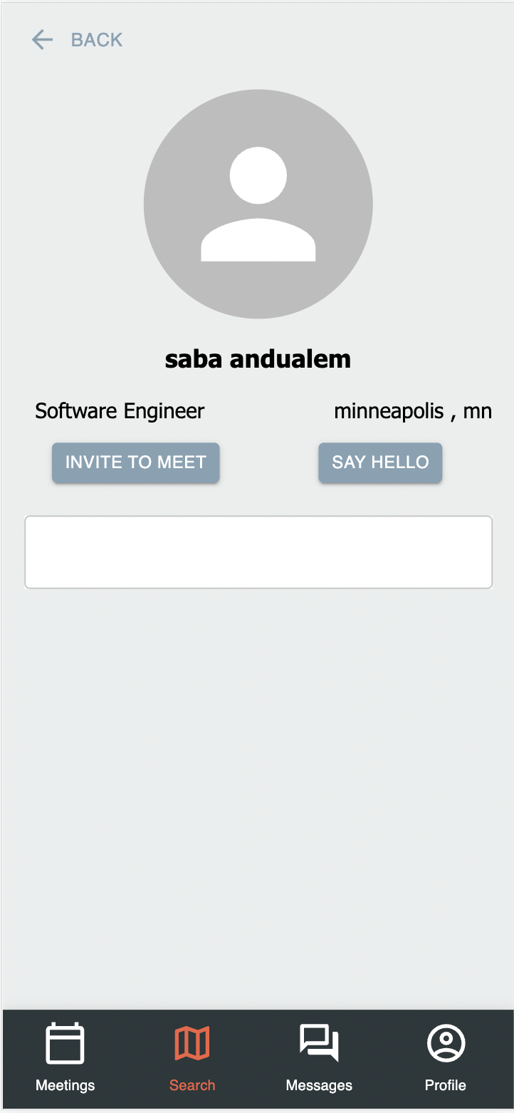
Current look of the app


The Process
Initial Research
My team and I first performed a cognitive walkthrough of each of the company’s stated user tasks for the app, going step-by-step and asking four questions:
Will the user try to achieve the right outcome?
Is the action visible?
Is there a clear connection between the control and the resulting action? Will the user have their expectations met?
Is there sufficient and/or appropriate feedback?
Main takeaways:
Actions within the app need more explanatory text to guide the user.
Most of the actions had straight-forward flows and good feedback within the app.
Some core features were missing and need to be designed and built out.
A screenshot of my team’s cognitive walkthrough
Contextual Inquiry and Usability study
Next, my team and I created a plan of action for contextual inquiries of potential users. These users included small business owners and workshop leaders who connect often with clients, contractors, and event attendees.
Research protocol
We crafted a script for contextual inquiry, and conducted it over one hour through Zoom.
The main goal was to get a sense of the user’s current patterns and practices when it came to networking, traveling for events, and keeping track of business expenses.
We also had time to show participants the current app prototype, to get their initial thoughts and feedback.
An excerpt of the contextual inquiry research protocol
Taking notes during the contextual inquiry
My team interviewing the users
A screenshot of the prototype tour
Research synthesis, User Stories and Sketches
Synthesis
We synthesized research in an affinity diagram, then siloed our work for the rest of the project, each creating individual user stories, sketches, and prototypes.
Main takeaways
There were a few main takeaways from our user research:
Users don’t want to cold call people. They want to know who they know in common or what events they have attended.
Users want to easily which meetings are today and which are not, in order to prepare for the day.
Users want clearer language from the app as to what each feature is for, and how it is intended to be used.
User Stories
Using the research we gathered, I crafted three user stories to guide my re-design.
They were:
As a small business owner, I want to see my meetings in a clear timeline so I know what I need to prepare for first.
As a user whose business connects contractors and businesses seeking contract work, I want to match with people who are active in my professional communities or share mutual connections, so that I don’t waste my time talking to people who aren’t relevant to my business’s goals.
As a user who travels to events, I would like to see local event pages with attendee lists so I can easily see who else is at the same event.
Information Architecture diagram and Sketches
I used these stories to construct a new information architecture diagram, focusing on the user stories. Then I sketched some potential screen layouts, to prepare for prototyping.
Our affinity diagram
My updated information architecture diagram for SPUR Connect
A new page, the event page
An updated home/search page
An updated meetings page
Prototyping
Finally, using the insights I had gained from the cognitive walkthrough, contextual inquiries, and drafting the IA diagram and low-fidelity sketches, I set to work on a prototype in Figma.
Due to the time constraints on this project, I chose to focus on my user stories. With more time I would have also built out the messaging feature, and added functionality for event hosts to create accounts and set up event pages through the app.
A sample event page
The new meetings timeline view
A heavily expanded and updated search page, now called 'Explore'
Prototype tour
I built a working prototype with annotation bubbles for the company, so they can easily see what changes I made, and the research and rationale behind those changes.
Preview it here or click the button below to see. If you have Figma account you will be able to see the comments. OR check out my video tour.
Conclusion
SPUR Connect has an exciting combination of features that business owners, entrepreneurs, conference-goers, and job-seekers could take advantage of and build their professional networks, while also organizing their expenses.
What we learned through talking with users is that a concept of this nature needs to inspire trust in its customers. My prototype reveals a few ways this can be achieved: shared connections and shared events.
Next Steps for spur connect team
Perform usability tests with this prototype, to ensure they are on the right path towards building trust in the user base.
Consider adding my proposed “Events” section, with opportunities for event hosts to create pages on the app.


