Sustainable Farming Association
Non-profit Website redesign and accessibility
Overview
The Sustainable Farming Association (SFA) is a farmer-to-farmer networking group, aiming to help farmers across the state of Minnesota share knowledge on adapting more sustainable, eco-friendly farming practices.
What was the challenge?
The SFA’s website was built 12 years ago in WordPress. It was in need of a total refresh - to update its responsiveness, clean up its navigation and content, and create a better experience for farmers and partner groups wishing to find technical resources and feel like part of a vibrant community. My team and I were challenged with providing SFA the tools to begin their redesign on the right foot.
What did I deliver?
As part of a five-person team, I helped facilitate meetings with stakeholders, performed user research, and assisted with design elements. In addition, I focused on giving the SFA team an Accessibility Guide to ensure that the updated site is not only WCAG 2.1 compliant, but a welcoming space to all users.
ROLE
UX Researcher
UX Designer
Accessibility Consultant
METHODS USED
Stakeholder Interview
Contextual Inquiry
Usability Tests
Fly-on-the-wall Research
Card Sort
Comparative Analysis
High-Fidelity Wireframes
Personas
User Journey Maps
TOOLS
Figma
Zoom
Powerpoint
Google Suite
Otter.ai
Keynote
DELIVERABLES
Annotated Wireframes
Personas
User Journey Maps
Style Guide
Comparative Analysis
Team Members
Kevin Peterson
Mar E Townsend
Brennan Kempston
James Sauer
The Challenge
The Sustainable Farming Association has run a farmer-to-farmer education network in the state of Minnesota since 1987. They provide resources for farmers wishing to care for the land and their animals. They also host popular annual events, such as the Garlic Festival and the Salsa Festival.
Their website was built in WordPress twelve years ago, and had not had a major redesign since. The template was outdated and not responsive. SFA stakeholders came to my team seeking a springboard from which to begin their site redesign process.
The SFA’s old homepage. Not responsive, visually lacking, cluttered ten-item nav bar, under-utilized footer.
Site Goals
We began with a stakeholder interview to better understand the organization, the site, and its users, as well as goals for the project. Overall, SFA stakeholders wanted a site that was:
Accessible
Responsive
Visually appealing
Less cluttered
My Role
User Research
The team and I conducted usability tests on the existing website, as well as contextual inquiries with active site users, and came to a few conclusions:
Users like the information on the site, but find it impossible to navigate
Users often come for event information and leave as quickly as possible
Conducting remote usability tests
In-person research and Card Sort
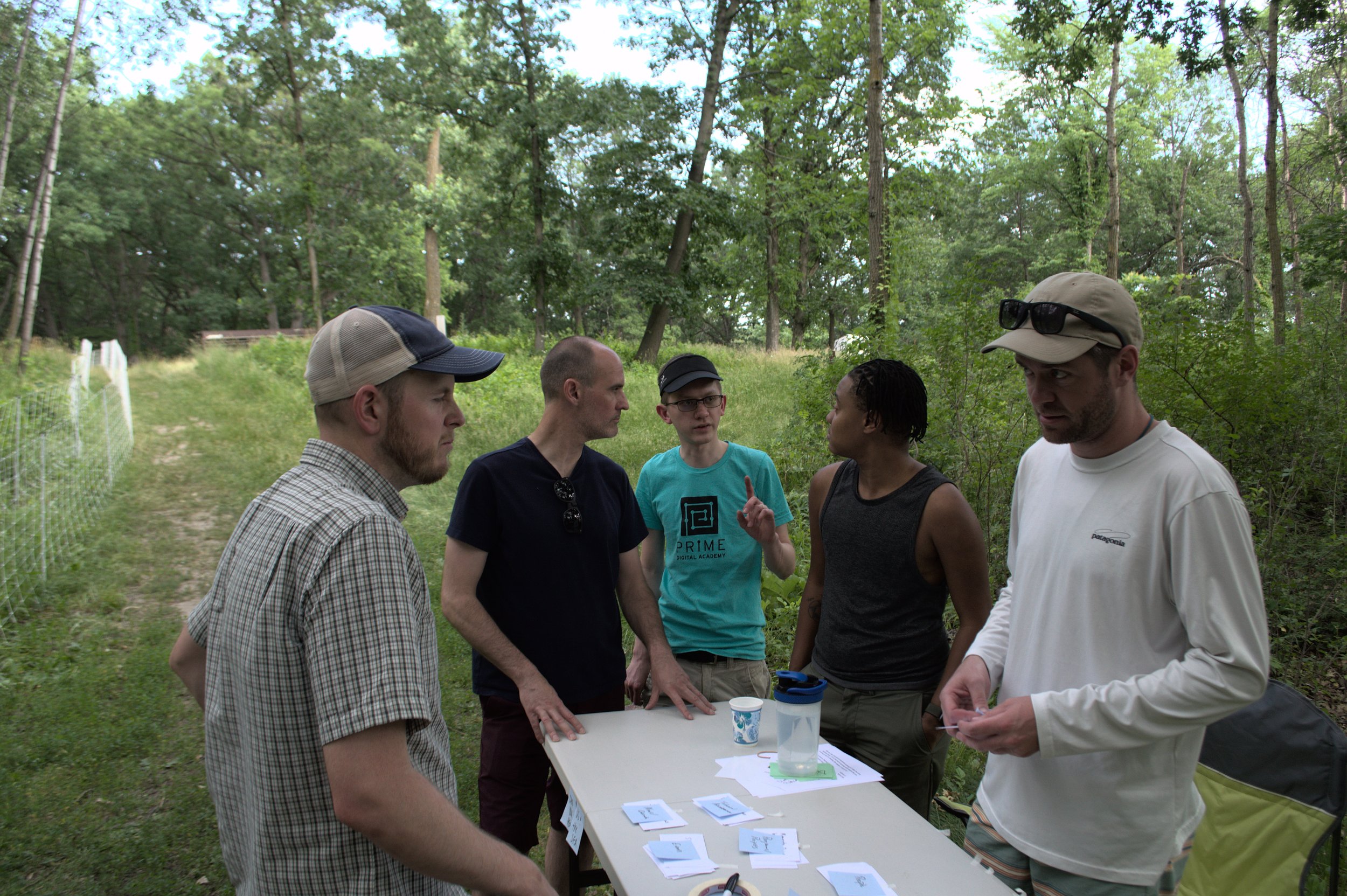
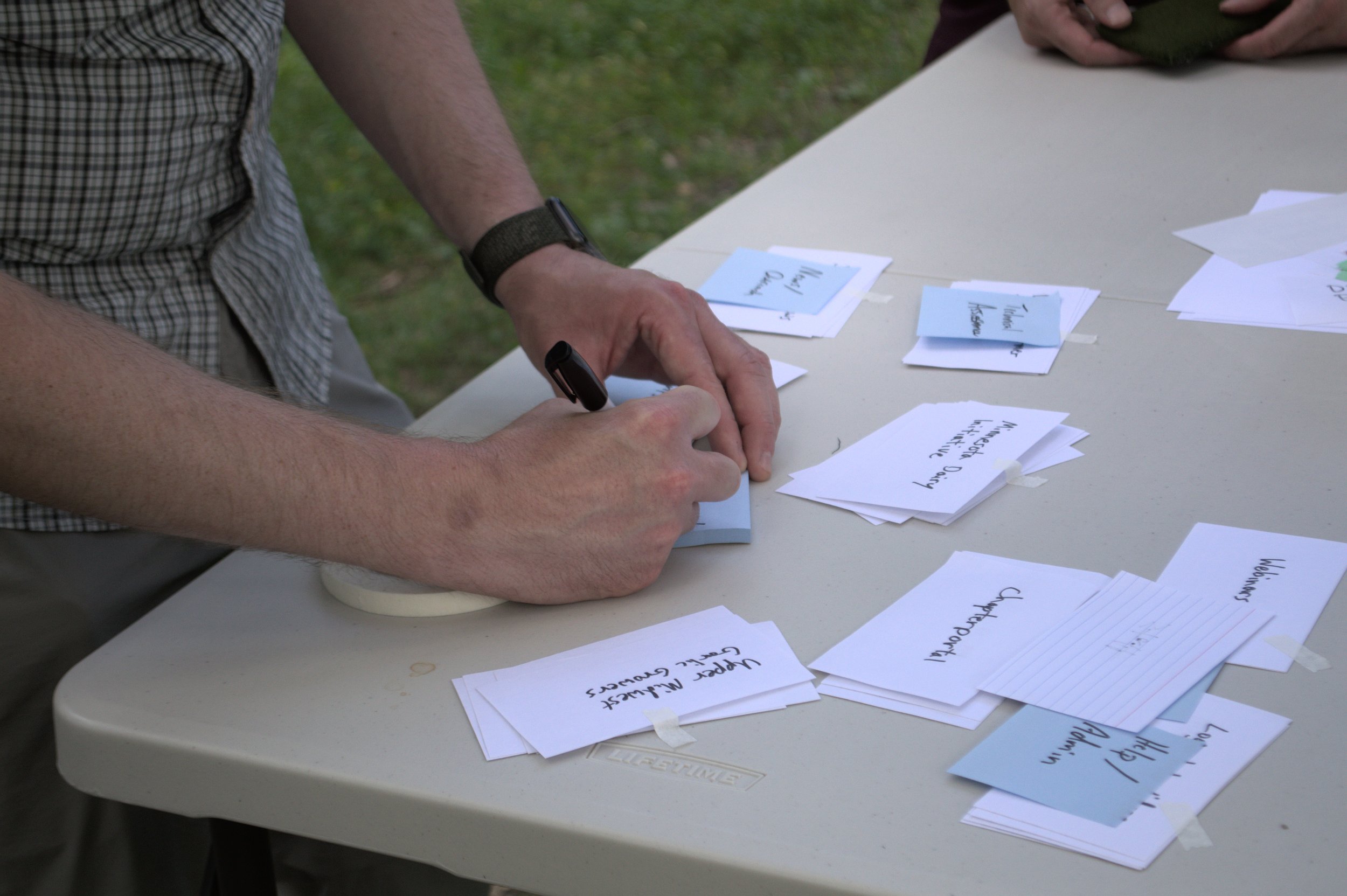
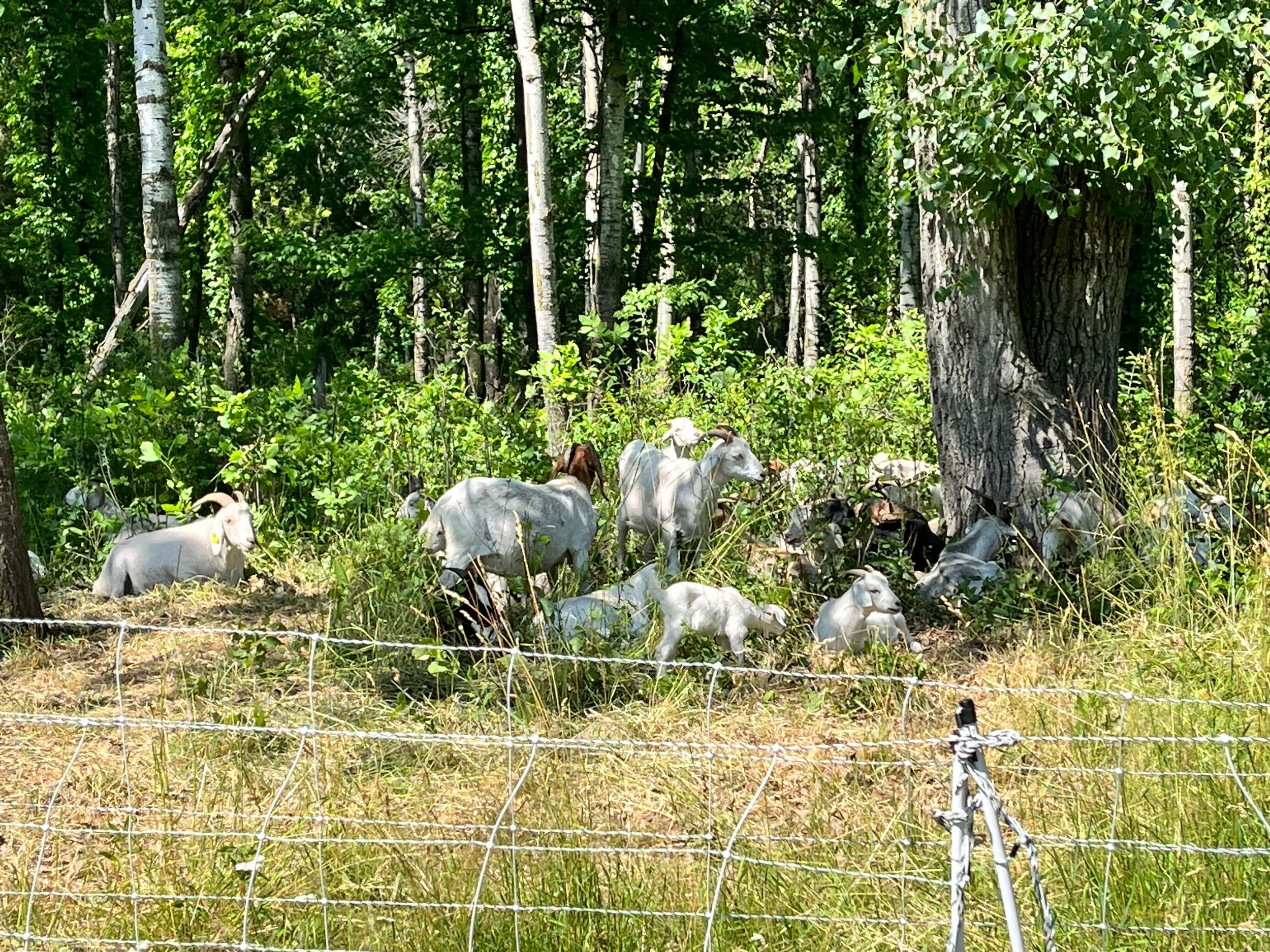
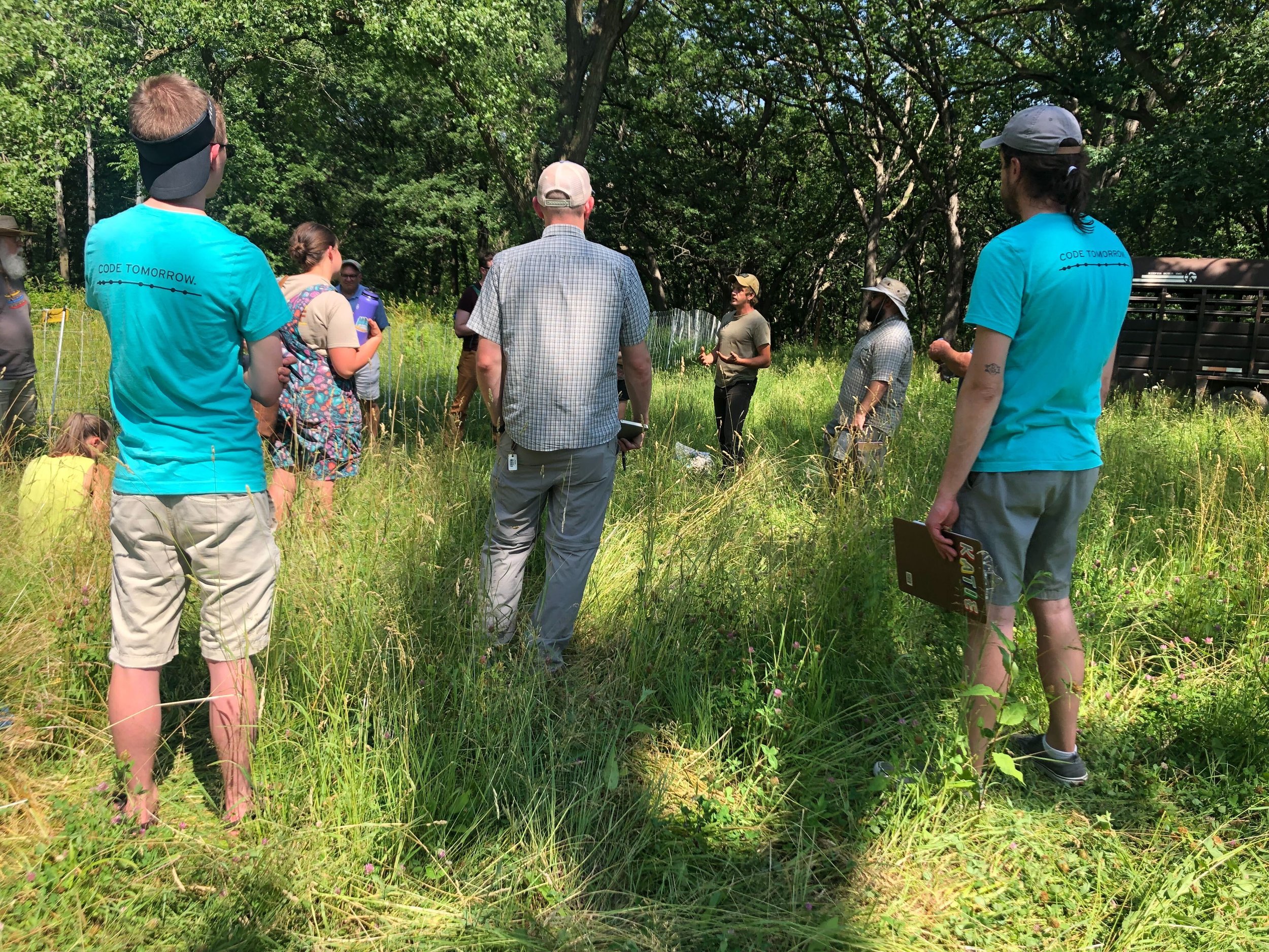
Finding farmers to interview during growing season proved to be a challenge, so I proposed we attend one of the SFA’s many events nearby to do fly-on-the-wall research, followed by a card sort with event attendees. This proved to be a highlight of the research process, and one of our best sources of user information.
Observing the live event demonstrated to the team the true power of the SFA: bringing knowledge and community together for Minnesota farmers and sustainability advocates. The SFA already has the ability to create great events, and the site simply needed to be the support structure for individuals and organizations seeking to engage with this work.
Event attendees were eager to share their thoughts on the website organization. We performed an open card sort, allowing users to create their own categories, since the old categories were a significant part of the site’s clutter.


Solutions
With the data from the card sort, we organized user-created headings into five main categories, with one to three sub-categories within each main category.
I built out these dropdowns using Figma components and auto-layout, and combined it with my teammates' redesigned home page.
The new Resources tab has three sub-categories: Education, Groups, and Programs.
Map
I also noticed a lack of ability for the site users to find things near their area, and usability tests confirmed that users didn’t have a good sense of which SFA chapters were located where. To solve this problem, we created an interactive map with chapter titles shown visually throughout the state.
Users can click on a chapter name to view that chapters information and events.
Accessibility
My main focus during this project was to create an accessibility guide for the stakeholders. I researched the Web Content Accessibility Guidelines 2.1, used screen readers and keyboard controls to navigate the site, and consulted with an accessibility expert.
I noticed gaps in site accessibility, and created a findings and recommendations report to show exactly how to improve accessibility throughout the site.
Excerpts from my accessibility guide.
Additional research
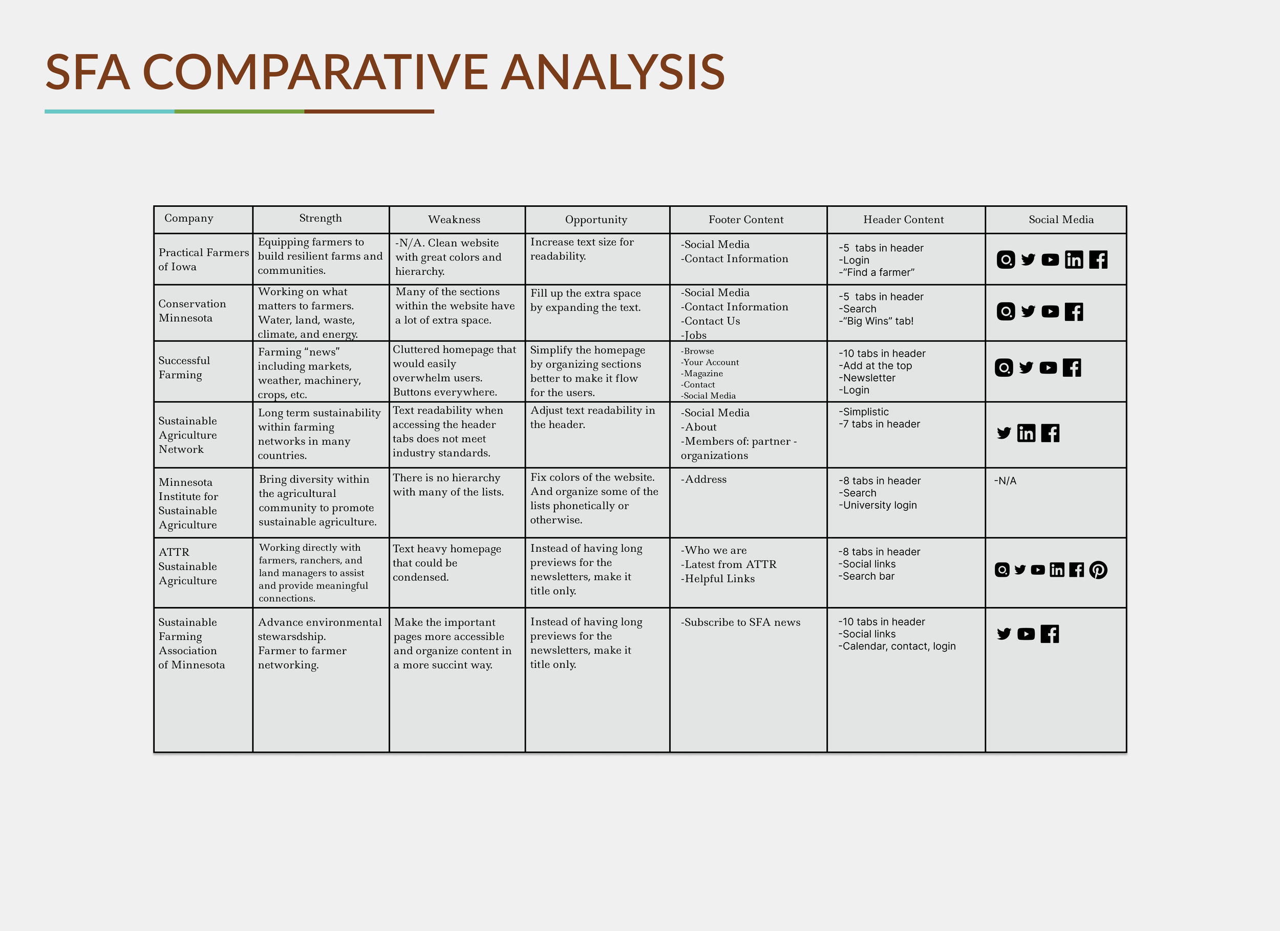
Our team also performed a comparative analysis, created site maps, two user personas and user journey maps, and an accessible style guide for the stakeholders.
These deliverables in hand, we crafted a presentation outlining the organization, the site, and our work, then packaged up the deliverables and held a final stakeholder meeting to discuss next steps.
Below are some highlights from our deliverables:


The Redesign
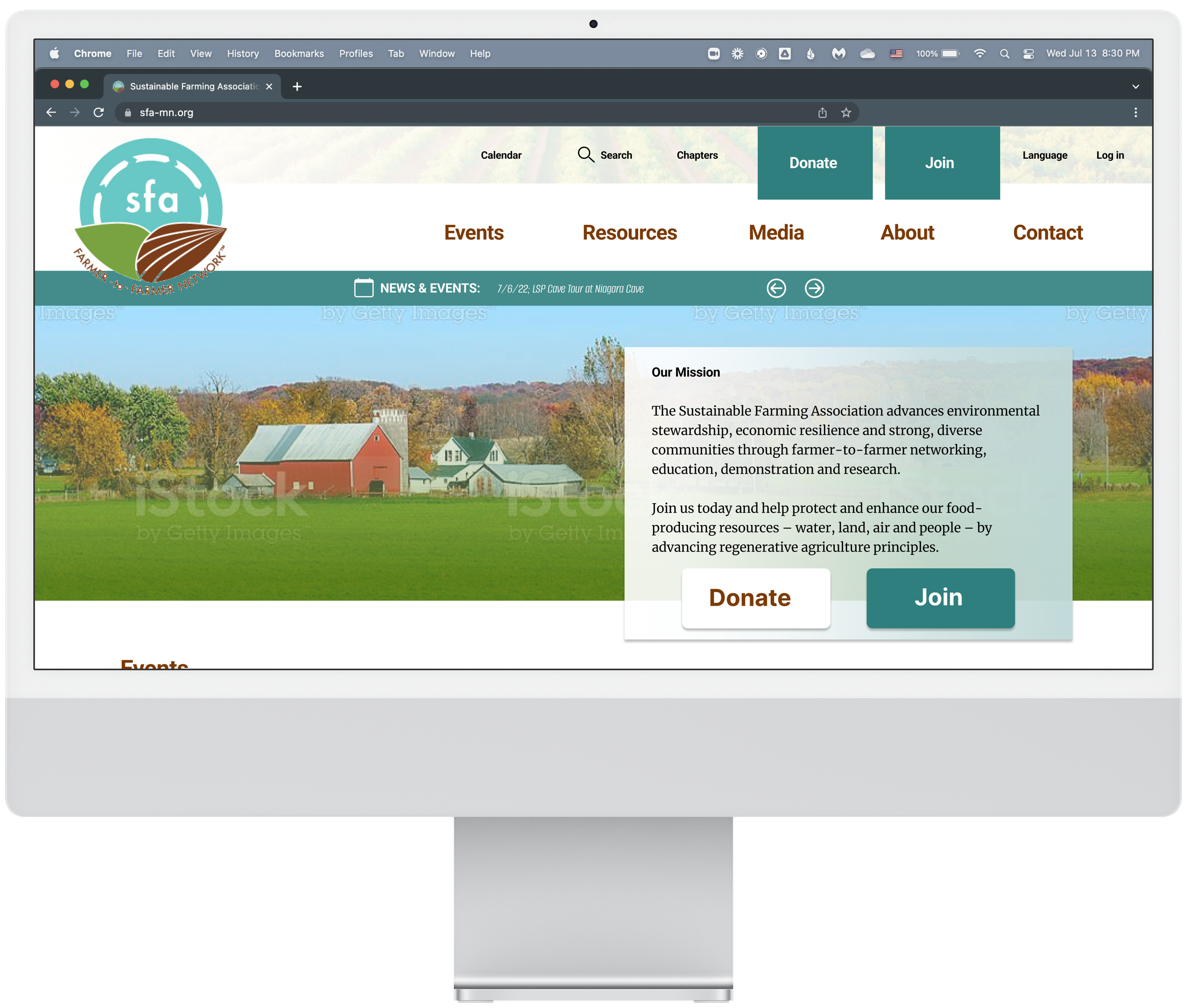
The response to our presentation from SFA’s executive director was entirely positive, citing it as an important artifact for helping convince the board of these necessary changes. With our deliverables in hand, the SFA unveiled their new site a few months later, after much internal hard work from their team members. Here is the new SFA website.
The new SFA homepage, featuring a new template with responsive design, and a greatly-improved nav menu. Visitors can immediately understand the SFA’s three core missions: hosting great events, providing resources, and creating communities.
Further down the home page - a modern, scrollable page with clearly-delineated sections.
Links are more clearly indicated for accessibility, through underlining of text links, and clearer indications of where a link will take the user.
Under Community → Chapters, we get a beautiful example of a website supporting the mission of an organization. Users can see chapter names alphabetically or interact with a map. Expandable accordions help explain the concept and benefits of SFA Chapters.
Conclusion
The SFA has stood as a beacon of community for sustainable farmers throughout the state of Minnesota for decades. It’s time their website reflects that history, wealth of knowledge, and strong community in a way that's clean, modern, and accessible.
New visitors to the site are now able to quickly understand the SFA and its mission, and easily find the resources and events they are interested in. Visitors can now feel empowered to learn more, and excited to become a part of the community.

